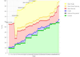
Two months ago, I took the job on putting Platform on Sprints. After some consideration, I have decided to follow the setup that I have for the AF team, creating the stories in the form of JIRA issues. However, the chart generation that I had for AF team was still semi-manual, which means that it takes a couple of minutes to download, and a couple of minutes to update the stats every morning. The worst part is that when I get busy or sick, I will forget.
So my first action item was to figure out how to generate the same kind of charts with the push of a button. The idea seems to be easy enough:
- Figure out the search criteria to retrieve all the JIRA issues of the backlog
- Count the issues that are in different states
- Update the data with the counts, and check it into Perforce.
- Refresh the chart with the updated data
Here is an example of the data generated. I think you get the idea just looking at it.
Date,Day,Closed,Deferral Requested,In QA,Open Stories,Open New Features,Open BugsNumber three took less time but a bit of research because Perforce Java library's API is not exactly straightforward.
10/09/2009,41,55,0,1,13,7,40
10/12/2009,42,55,0,1,14,7,40
10/13/2009,43,56,0,0,14,7,40
10/14/2009,44,56,0,0,16,7,41
10/15/2009,45,56,0,0,21,8,42
10/16/2009,46,58,0,1,19,8,42
10/19/2009,47,58,0,2,28,8,42
10/20/2009,48,58,0,6,26,8,42
10/21/2009,49,58,0,6,26,8,42
10/22/2009,50,58,0,7,25,8,44
It took me a while to figure out how to do the last one. After looking into JFreeChart and Google Chart API, I eventually turned to my dear friend, Tod Landis, who is also my partner at Entrance, and he quickly drafted an entrance script for me. Based on it, I was able to write a template that can be used for all teams within a few hours.
PLOTPlease note this is the final PLOT script, there are other SQLs run before this to import the data into the MySQL database, sum up the data to produce a stacked chart, and even out the labels.
very light yellow area,
light yellow filled circles and line,
DATALABELS
very light orange area,
light orange filled circles and line,
very light red area,
light red filled circles and line,
very light blue area,
light blue filled circles and line,
very light gray area,
dark gray filled circles and line,
very light green area,
dark green filled circles and line,
all AXISLABELS
WITH
ZEROBASED
TITLE "Sprint"
TITLE X "Days"
TITLE Y "Points"
SCALE Y 0 100 0
CLIP
legend
gridlines
collar
no sides
SELECT
`Open Bugs`,
`Open Bugs`,
date,
`Open New Features`,
`Open New Features`,
`Open Stories`,
`Open Stories`,
`In QA`,
`In QA`,
`Deferral Requested`,
`Deferral Requested`,
`Closed`,
`Closed`,
day
from report;
And I now have this chart generated automatically every morning with the help of a windows scheduler.


No comments:
Post a Comment