I have always thought Sprint reporting is a major communication tool to be used within the team as well as to the outside. It is the time for the team to take one step back, look at the project as a whole, comparing notes, and make continuous improvements. It is also the time for the team to report the progress and any difficulties encountered, so that the stake holders can make plan adjustments and provide help if needed.
Burn-up and burn-down charts are my favorite report, because they fit very well in the story based iteration model of the project development. Anyone understanding stories and iterations (not that it is always easy to learn) can understand these charts very easily. I also find that these chart can generate more questions and lead the team in the right direction.
Burn-down chart is straightforward and easy to understand. It measures the burn rate of the story in the unit of the story points. It is really easy to understand different ways of predicting the outcome of the project by predicting the future velocity of the Sprints.
All the iteration tracking tools that I have tried have this support. This one is made by Pivotal Tracker.
For those who use JIRA or good-old story cards to track the iterations, it is not hard to produce this chart as well, with the worst part being figuring out where to use what formula. The following are from the other two projects, made with Microsoft Excel and Google spreadsheet. With customized tool, I get to explore different styles.
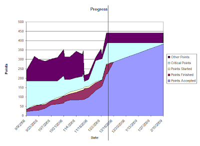
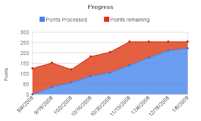
In the first one, the stories are divided into "must-have" and "everything else" category, and tracked at the same time. The prediction lines are shown in different color. In the second one, the progress is shown along with the burn-down, so that in the case where it is actually "burning up", it shows that it is not caused by losing velocity.
Burn-up Chart
For a project with just a single coach, burn-up chart can be a great help. It can explain a lot of concepts in the story based development, iterative development, and can help the coach recognize the patterns in the development and take actions to adjust the direction of the team.
I have found that burn-up chart always a bit harder to understand, and might look intimidating. So if you are introducing it for the first time, you should not just paste it in a report and email to others. It is best to show it in person and let the conversation start.
 The first chart shows a project where development is fairly smooth, QA can just keep up with the story being finished. On the other hand, the project requirement is very volatile. The interesting thing to point out is that because the team is focusing on one Sprint at a time during the release, and one story at a time during the Sprint, the dramatic scope changes did not affect the development at all.
The second one is a quite typical burn-up chart, where the team discovers new cases as they go, and adding the understanding to the backlog in the form of the stories.
Sprint Burn-up Chart
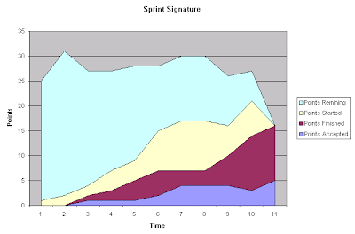
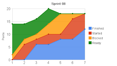
I also found a burn-up chart for the Sprint is useful to figure out what happened during the Sprint. I think this is what is called "Sprint Signature" in the SCRUM book.
A Sprint burn-up chart should be used strictly internally, because only the team who have just been through the Sprint can look at it, talk about it and then draw conclusions. This should never be used for managerial purpose, in my humble opinion.


5 comments:
Why not use a sprint burn-up chart for managerial purposes? Couldn't it help management understand why the team failed to meet sprint commitments?
Why do it by hand and keep it up to date (not to mention share it with your teammates) When you can use a simple tool to do it for you (www.burndown-charts.com).
And if you have Pivotal Tracker it's even better because www.burndown-charts.com syncs automatically and generates a chart for you.
The burn-up chart seems really nice.
I always found pivotal tracker "native" burndown charts a bit hard to read and understand. What do you think of an integration tool like http://www.burndown-charts.com?
Totally agree. A tool makes perfect sense.
Thanks for introducing the burndown-charts. I took a brief look and had two questions
1. Does it do burn-up as I described in the blog post. As you can see I have found that to be more useful
2. Does it integrate with an internal JIRA instance somehow? That was the main driver for building it through excel. I didn't need to do that with Pivotal Tracker.
For the other comment about using sprint burn-up chart for managerial purpose, I am afraid it bypass the critical communication between the team and the manager.
It should be up for the team to explain why the they fail to meet the sprint commitment (and if they really did 'fail' in the first place). I don't not believe that the sprint burn-up chart can help manager who is not directly involved with the tam can determine anything at all because of the many factors that affect this chart.
Post a Comment